Saturday, 24 February 2018
Week 6
I know I'm jumping ahead a bit here but I like to cram.
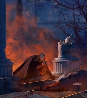
We had talked two weeks ago about the bottom image so I altered it with your feedback in mind; I changed the dimensions, placed the castle, and moved the victim's body to be perpendicular to the ghost. I also painted the broken pillar to be more believable, careful to show the damage on multiple planes. I think this image is more or less "finished," although I'm sure you have additional feedback, Donald. I'd love to hear it. I had briefly placed the castle in the middle as you had suggested but it simply felt too empty on the left when doing so. The tree limbs to the right make the composition heavy on that side so I wanted to balance it out a bit by placing the castle on the opposite side.
The middle image is for the alley prompt. Something feels slightly off but this may simply be because I'm not finished with it. The hero feels like she's floating a bit. I know the perspective is accurate (built in 3D), so I think maybe her flesh-colored legs might be the problem. They seem to "pop" more than I'd like.
Overall, I wanted this scene to feel fairly static; the hero has shown up after the victim has been slain and is more or less simply observing. I want to give her a sense of weight, power, and a general stoic quality.
The above image details my thumbnails for the space prompt. I want to emphasize more of the environment here (since I'm aiming to create such a portfolio) as well as the scale of space in general. Therefore, I want the astronaut to be very small. The alien probably won't have tentacles (too cliche). I was just placing it there for scale. I also want to imply more movement and action in comparison to my previous two images so I've played around with the idea of the alien ship or creature attacking the human vessel.
Thank you in advance.
Subscribe to:
Post Comments (Atom)


Good work Christopher. I like #4, 7 and 12. I would like to see them with a bit more details and possibly with few shades so that we can understand the main light source in each scenes.
ReplyDeleteThere's a lot to discuss for your alley scene: it lacks contrast overall (drape is the same color as main character, street is the same color as victim), heavy textures overwhelm the whole image, loads of circles and ovals (I count 9). To convey the idea that she did not do that is pretty hard here... She might have a strong solid pose but the camera view does not make it as powerful as it should. Actually I would leave the flesh-colored legs at this stage because with the headlight it is the only thing that makes your hero visible.
Ghost scene looks good. Again,it's quite busy texture wise I think. We'll talk about it in class. I would like to do a quick demo with it if you don't mind.
Thanks, Donald. I'll flesh out those thumbnails you picked out.
DeleteFor the alley scene, I'll probably change her left arm and head to be flesh colored as well, actually, along with working on a few extra things.
For sure on the ghost; feel free to rip it apart.
Thanks again.